
Wednesday, 9 March 2011

The Making of the Poster

Experimenting with the poster.. This was the original image that I was going to use for my poster, however my group memeber sent me the new pictures that we took, therefore I chose to change it to one of the new photographs because I wanted to have a key graphic image which would be similar to the one used on the magazine so that the target audience would automactically know that this is the house style of the film.
I chose to try out a few different edits of the colour of the eyes and the main image itself to experiment and see which one looked the most effective:-

I edited the images on Adobe Photoshop and in this particular one, I chose to change the face to black and white and make the blood on her face red to make it a really strong image. However I felt like I wanted to change the eye colour tomake the image more striking.

In this version of the poster I changed the eye colour to green however I thought that this did not look scary enough and also looked slightly fake therefore did not give the image a professional look.

This is another image that I edited and I made the characters eyes have a more effective horror look. I made scelra (the white bit of the eye) black and the pupil green. I liked this version however I wanted to experiment around a bit more to see if other colours would look better however I will be keeping the scelra black because I think this adds to the horror feel.

In this version I tried out purple however I do not think it looks very realistic therefore I will not be using this image.

I also experimented with a turqiose colour, however this colour is not a conventional horror colour so I do not think it fits the horror genre very well ad I will not be using this one.

This one was my favourite because it is a subtle blue however I think it looks very effective and conventional to the horror genre. I will be using this image as my poster image because I think that this is the most striking image.

In this image I tried something different by adding a red tint on the image and I think it looks effective however I wanted the red blood on her face to stand out more and I think that this is more apparent on the black and white face.
Therefore I will be using the image with the black and white face with the red blood across it with the black and blue eyes, as this is also a similar image to the one used on my magazine cover therefore I would like the target audience to recgonise these two images and automatically link them together.
The Making of the Magazine Cover
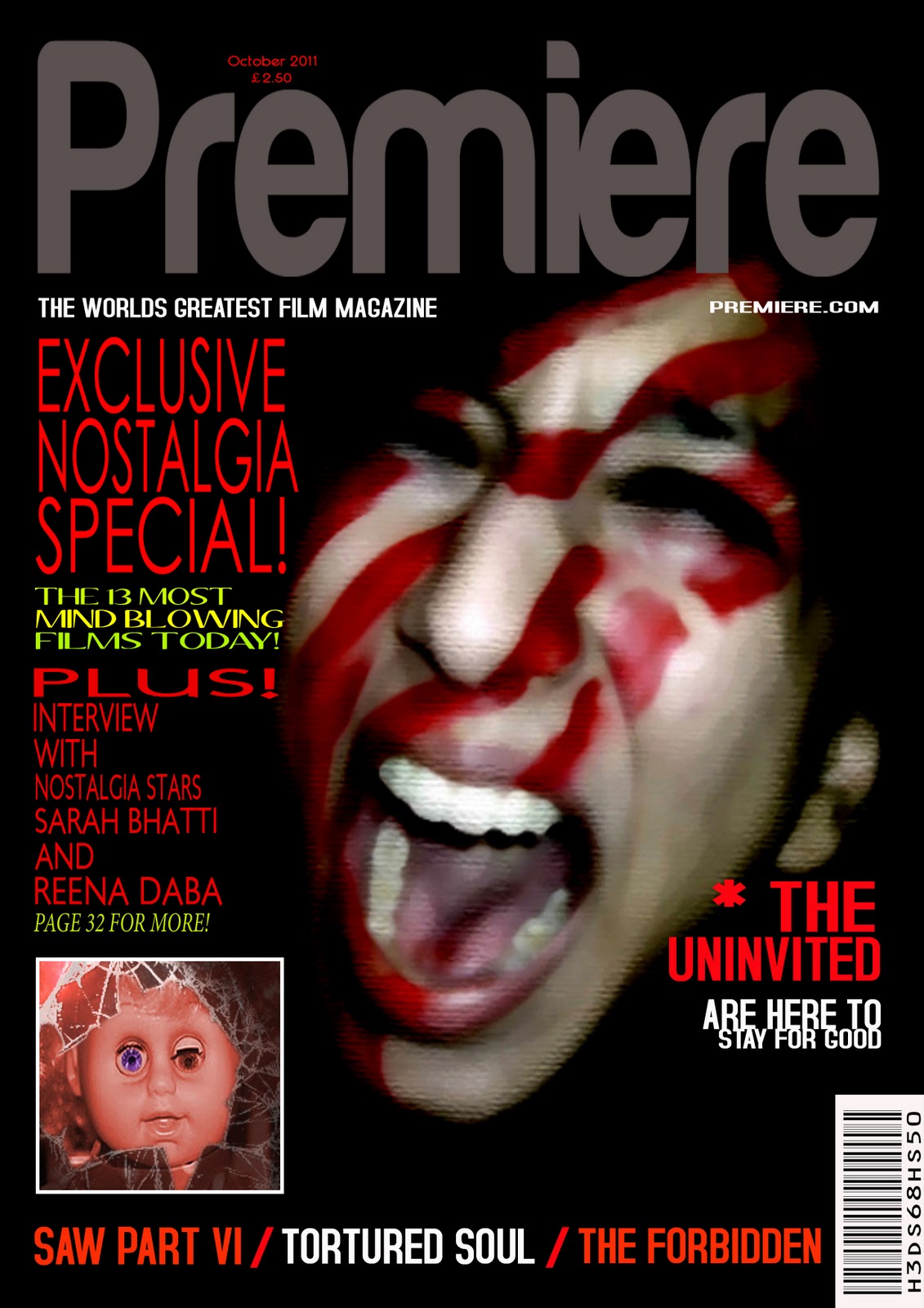
 This is my magazine cover, this is nearly the final edit, however I still need to move the position of the date and the price because this is not in a conventional place on this draft because I wanted to try something new but in this case it did not look effective and it is not a place that the audience would normally look for the price and the date. I also need to make the doll image more scary to make it obviously horror instead of the comical look it has now, this image needs to be darker and have some effects on it to make it have a really dark look. I need to fill up the empty space on top of the banner by making the main image bigger because it would look more filled out and therefore like a professional magazine. But overall I think that my magazine is almost finished and I am quite happy with the progress of creating it so far.
I tried to change the picture to red to match the rest of the magazine and see if this would look better however this looks a bit too pink and therefore does not give the magazine the look I wnat it to have.


I added this blue filter and this broken glass effect around the doll image however I do not think this looks dark enough and it still has a bit of a comical look to it

 I have been experimenting with the different pictures and I have chosen to use a new doll image altogether because I feel that the image I was using before was more comical becasue the eyes were half open and half closed. I have been researching different scary doll images on the internet and I found a picture that I took some ideas from for my doll image such as the dark rings around the eyes and the dirty look that gives the doll its horror look and I think that this images goes a lot better with the whole look of my magazine than the original one I was going to use. I still need to add the date and price and make the kicker next to the main image slightly bigger to make the layout of the magazine look better.
This is nearly my final magazine cover; as you can see I have changed the image of the doll, the size of the main image, the size of the kicker on the right hand side of the main image, the positioning of the date and the price. However I do not think that the positioning of the the price looks good because it is too big and is in an unconventional place, therefore this is the final thing that I will be changing. The magazine cover is in a much better quality magazine cover because I was saving it in JPEG format before however I realised that saving it in format makes the quality much better.
Monday, 7 March 2011
Viral Campaign
I have made a facebook fan page as part of the viral campaign for Nostalgia which will really help promote the film as many people from my target audieence age group are on facebook on a daily basis.

I have also created a like page with information about the film on it to create a real buzz about the film and get more peopel to know about it.


Our group would like to use this teaser trailer as a template and create something similar as part of our viral campaign, this will entice our audience to want to watch our film as they will be confused and curious because this baby video will be so random as it will just be sent to our target audience's email addresses, social networking websites such as facebook, twitter, hi5, bebo, etc. and their mobile phones and our target audience will be wondering why this creepy doll advert has been sent to them.


Our group would like to use this teaser trailer as a template and create something similar as part of our viral campaign, this will entice our audience to want to watch our film as they will be confused and curious because this baby video will be so random as it will just be sent to our target audience's email addresses, social networking websites such as facebook, twitter, hi5, bebo, etc. and their mobile phones and our target audience will be wondering why this creepy doll advert has been sent to them.
Subscribe to:
Comments (Atom)