Tuesday, 28 December 2010

Production Stills

These are some photographs of me getting ready and doing my make up for the scenes that I have been the main character in, i.e. the flashback scenes:


These production stills are of Sarah and I on filming day 1


These are photographs of Sarah preparing the bathroom scene, she is writing in red on the mirror which is a common convention of horror films.


Wednesday, 15 December 2010

Personal Diary Entry

We have also come up with different name ideas for our film and have decided to use Nostalgia for reasons I have explained below and I have also completed the intre-title ideas so that when it comes to editing I will know what scenes are relevant to the intre-titles and where to include them. The reason we have decided to use intre-titles is so that our audience can follow the narrative and not be confused but we will also try not to give too much away so that we make the audience want to watch the film to find out more. We have done the camera testing so that we could make sure that the camera was a good enough quality to film what we wanted to in a professional manner.
I have also completed the running order of each scene so that I will know what goes where when it comes to editing the trailer as we will be individually editing our trailers I believe that this will help me in the long run and make things more organised and simple.

Tuesday, 14 December 2010

Title Design

This is my title design for my film- Nostalgia
I have chosen to use this title design because I think that it works well with the horror genre and my trailer in particular. I like this title design because it works well with my trialer especially because it has the same blood effect that my end scenes had when Natasha was being dragged on the floor. I felt that I could make the title look better by changing the colour scheme, I edited this on Adobe photoshop and have uploaded the print screens below to show what steps I used to achieve the final look. I think this will look effective on the trailer because it has the dramatic look I wanted and will stand out to our target audience.


I considered using other fonts such as the ones below but I thought that there was flaws in them as some were too simple such as this one. This font reminded me of vampires therefore I though that it didn't go well with my trailer.

This font does not really go with my trailer either because it is more like a science fiction font therefore I didn't want to include it in my trailer.

The font below is quite simple and not eye catching enough so I wanted to look for something more dramatic and it also reminds me of vampires and that doesn't fit into the narrative of my trailer.

I like the effect of the degraded writing in this font as in my last scenes I used the scenes of Natasha being dragged on the floor. This has a scratching effect on it because it is degraded and Natasha was scratching on the floor therefore this font works well. However I wanted to use much more dramtic font so I chose not to use this one. 

Shooting Schedule

Ideas of film names

'Nostalgia' is the name we choose to use because it was effective and relevant because our film is about a flashback and the past coming back to haunt the girl that has just moved into her new house.


The other names we came up with were 'The Following' because she was being followed by the doll but then we thought that it wasn't very effective because she wasn't really being followed and this name might have confused the audience because they might have thought someone was following her. Other names we thought of were 'The Eye' but there is already a famous horror film which came out recently that is called 'The Eye' therefore we thought that this name would not be very good and it is also not what our narrative is about because it is about the girl getting haunted by a possessed doll from the past. So then we thought of a name to do with the doll which was 'The Haunted Doll' but we thought that this name was a bit childish and very mediocre and it would not attract our target audience because it sounds too obvious and not very interesting.

Wednesday, 1 December 2010

Specific Planning

Our group has planned out what we going to use to make our trailer and how we want the end product to look.


Costume- We have thought carefully about what we need to include to appeal to our target audience therefore we planned the costumes based around what conventional clothes in horror films targeted at young adults and teenagers. We came up with a few ideas, one was that the main character Natasha should wear a short skirt to attract the male audience with sex appeal however we wanted to give her a sweet and innocent, girl next door type of look so we chose a simple typical teenage costume of jeans and a black t-shirt. We still wanted to have sex appeal in the trailer to attract the male target audience but not too much so that the female target audience would still want to watch it therefore we chose two costumes for Skye (who is only in the flashback scenes)- 1) a low cut black top and red pajamas as red can connote danger and also lust/love and 2) high heel boots which is feminine and 'sexy' and red tights because red connotes danger and also lust/love.


Hair and Make up- We wanted Natasha to have an innocent look but still be pretty as the main girl in horror films is also young and good-looking therefore we had her wearing make-up but only simple mascara and lip gloss to give her a naturally pretty look. Natasha had her hair down as long hair connotes femininity therefore this will attract our target audience.
For Skye we wanted give her more of a 'sexy' look therefore she wore red lipstick and very heavy black eyeliner and mascara. She also has her hair down to show her femininity as this will attract our target audience.


Set-The set is in an old looking house and we will use lots of different rooms of the house to give our trailer lots of variety, these rooms will include the kitchen, living room, corridor, garden, staircase, front door, a scene of the front view of the house, a room which be used for the hidden room, etc. This will keep our audience interested.


Casting-  We chose to use the most reliable people in our group to be members of the acting cast, this was Sarah and I. Sarah played the part of Natasha and I played the part of Skye. We want our characters to have dramatic acting but still be realistic therefore we will both try to practice our acting and take a lot of shots until we get the scene right. We also chose Sarah and I to be in the trailer because we felt that we were more effective actors and Gagan was better at filming, however we are all going to film scenes.


Music- As we are all editing our own trailers I have planned my music and sound effects on my own. I want to have dramatic sound effects which will be full of suspense such as, heartbeats, distant screaming, the baby laughing in an evil way, creepy sound effects of weird sounds, etc I will also have some normal sound effects in the beginning such as when Natasha is washing up I want to add normal washing up sound effects and when she hears the doorbell and opens the door I am going to add a typical doorbell sound effect and typical nighttime outside noises such as crickets chirping, etc.

Storyboard/ Anamatic

This is the storyboard that I created for my horror trailer, the reason for making this storyboard is so that the trailer will be easier to make as it is a more organised way of knowing what scenes to include where.


I created this storyboard anamatic on Adobe Premier, I used all of the images from my storyboard and then I changed the length of the images to show how long I wanted the scenes to last. I also used sound effects to get an idea of what my actual trailer will look like and this also gives a more realistic effect to how the anamatic will pan out as a real trailer


Tuesday, 30 November 2010

Personal Diary Entry

I have completed my call list and treatment sheet which I feel will be very useful to our group as we will be more organised. I have also completed the filming schedule so that it will be more organised when it comes to filming each scene/shot. I have also finished my production logo which I am very happy with as I believe it looks professional and effective, and I am also happy with the name because I think that it fits in really well with our trailer. As a group we have been working quite well but our group have a had a few problems with certain members arguing and not cooperating but in the end we have put all differences aside and have worked as a group because it is important to be able to work well in a group

Production Logo


My next step was to save image to my hard disk and import it into adobe photoshop cs3.

Then I duplicated the original image layer.
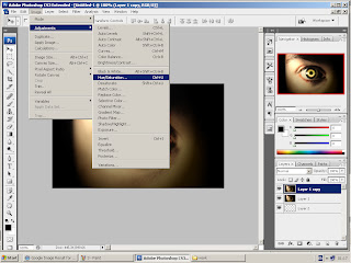
 I then manipulated the colours using adjustments/ hue and saturation, to convert the original colours to a red theme which is a conventional colour associated with horror.

  I manipulated the colours using adjustments/ hue and saturation, to converted the original colours to a red theme which is a conventional colour associated with horror.

 I rubbed out unwanted redness around the eye to reveal the layer beneath.


I rubbed out unwanted redness around the eye to reveal the layer beneath.


I used the crop tool to extend the bottom of the images canvas.
Then I coloured ''layer 2'' background in black.
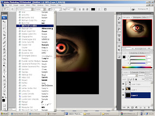


I then selected the font I wanted to use for ''red  eye- productions''. I chose this font because I liked the way it had a degraded effect which makes it look scary and therefore perfect for a horror logo.

Then I selected the colour of the font, which is red as it is a conventional colour associated with horror as it connotes danger, blood, ect. 
I then typed ''Red Eye Productions" onto my logo.
 
I selected free transform option to stretch the font to an appropriate size.
I selected free transform option to stretch the font to an appropriate size.

I added the finishing touches to the image, using adjustments-auto levels and auto colour.


I added a final finishing touch to the image, using the cross hatch filter.
This is my finished production logo- Red Eye Productions


I have also been researching different horror production logos' so that I could get ideas about what a good production logo should look like and what colours and what kind of font to include, but I felt that I could make my production logo look much better as I didn't like most of the example I researched because they were not very professional looking, although I did use the colours red and black as this is a convention of horror logos' and I did use a font similar to the ones I researched as it is bold, degraded and red which is also a convention of horror logos'.


I tried to think of some different names for my production company and I felt that because it was a horror company that my first idea of what sounded like a production company was 'Cannon productions', this was not very effective and it was irrelevant. The second idea I came up with was 'Sliced eye productions' but I felt that this was too it does not really have any meaning to it because there was no sliced eye in our trailer and I also got audience feedback and they said that they preferred my third idea which was 'Red Eye Productions'. 'Red Eye Productions' is relevant because in my individual trailer I had a close up of a red eye and I thought that this worked really well with the whole narrative and horror genre.


I went onto safari web browser and google.com and typed in 'eye' to look for a good image to start with and I found an image I thought was very effective because it is dark and mysterious which fits my genre very well.