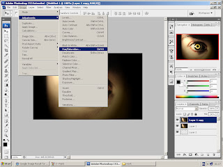
Then I duplicated the original image layer.
 I then manipulated the colours using adjustments/ hue and saturation, to convert the original colours to a red theme which is a conventional colour associated with horror.
 I manipulated the colours using adjustments/ hue and saturation, to converted the original colours to a red theme which is a conventional colour associated with horror.
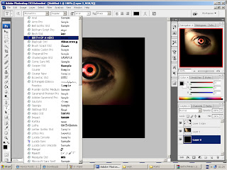
I rubbed out unwanted redness around the eye to reveal the layer beneath.
 I then selected the font I wanted to use for ''red eye- productions''. I chose this font because I liked the way it had a degraded effect which makes it look scary and therefore perfect for a horror logo.
Then I selected the colour of the font, which is red as it is a conventional colour associated with horror as it connotes danger, blood, ect.
I then typed ''Red Eye Productions" onto my logo.
I have also been researching different horror production logos' so that I could get ideas about what a good production logo should look like and what colours and what kind of font to include, but I felt that I could make my production logo look much better as I didn't like most of the example I researched because they were not very professional looking, although I did use the colours red and black as this is a convention of horror logos' and I did use a font similar to the ones I researched as it is bold, degraded and red which is also a convention of horror logos'.
I tried to think of some different names for my production company and I felt that because it was a horror company that my first idea of what sounded like a production company was 'Cannon productions', this was not very effective and it was irrelevant. The second idea I came up with was 'Sliced eye productions' but I felt that this was too it does not really have any meaning to it because there was no sliced eye in our trailer and I also got audience feedback and they said that they preferred my third idea which was 'Red Eye Productions'. 'Red Eye Productions' is relevant because in my individual trailer I had a close up of a red eye and I thought that this worked really well with the whole narrative and horror genre.
I went onto safari web browser and google.com and typed in 'eye' to look for a good image to start with and I found an image I thought was very effective because it is dark and mysterious which fits my genre very well.


No comments:
Post a Comment