Tuesday, 30 November 2010
Personal Diary Entry
I have completed my call list and treatment sheet which I feel will be very useful to our group as we will be more organised. I have also completed the filming schedule so that it will be more organised when it comes to filming each scene/shot. I have also finished my production logo which I am very happy with as I believe it looks professional and effective, and I am also happy with the name because I think that it fits in really well with our trailer. As a group we have been working quite well but our group have a had a few problems with certain members arguing and not cooperating but in the end we have put all differences aside and have worked as a group because it is important to be able to work well in a group
Production Logo
Then I duplicated the original image layer.
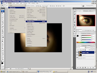
 I then manipulated the colours using adjustments/ hue and saturation, to convert the original colours to a red theme which is a conventional colour associated with horror.
 I manipulated the colours using adjustments/ hue and saturation, to converted the original colours to a red theme which is a conventional colour associated with horror.
I rubbed out unwanted redness around the eye to reveal the layer beneath.
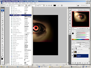
 I then selected the font I wanted to use for ''red eye- productions''. I chose this font because I liked the way it had a degraded effect which makes it look scary and therefore perfect for a horror logo.
Then I selected the colour of the font, which is red as it is a conventional colour associated with horror as it connotes danger, blood, ect.
I then typed ''Red Eye Productions" onto my logo.
I have also been researching different horror production logos' so that I could get ideas about what a good production logo should look like and what colours and what kind of font to include, but I felt that I could make my production logo look much better as I didn't like most of the example I researched because they were not very professional looking, although I did use the colours red and black as this is a convention of horror logos' and I did use a font similar to the ones I researched as it is bold, degraded and red which is also a convention of horror logos'.
I tried to think of some different names for my production company and I felt that because it was a horror company that my first idea of what sounded like a production company was 'Cannon productions', this was not very effective and it was irrelevant. The second idea I came up with was 'Sliced eye productions' but I felt that this was too it does not really have any meaning to it because there was no sliced eye in our trailer and I also got audience feedback and they said that they preferred my third idea which was 'Red Eye Productions'. 'Red Eye Productions' is relevant because in my individual trailer I had a close up of a red eye and I thought that this worked really well with the whole narrative and horror genre.
I went onto safari web browser and google.com and typed in 'eye' to look for a good image to start with and I found an image I thought was very effective because it is dark and mysterious which fits my genre very well.
Filming Schedule
This is my filming schedule which I have completed to make things run smoothly on the days of filming.
Shot List/ Shooting Script
Our group decided what kinds of shots we wanted to include in our trailers but as we edited them individually the order of the scenes and some of the scenes included varies.
Personal Diary Entry
As a group we all had a turn filming which allowed us all to be involved, the reason I wanted to film as well as act was because I wanted to improve and use the skills that I have in filming such as using different camera angles and shots to make our trailer more effective. Whilst I was acting my other group members also got to film therefore we included everyone in the group to make sure we all were treated equal in the filming.
I have been very committed and busy with my media coursework over the past weeks. I havefinishedthe storyboard and animaticswhich I feel will be a huge help to us in organising everything and making sure we know what scene goes where. I have made two production schedules, the point of making these production schedules is so that our group knows what date everything was happening on and also so that we are all organised and complete things on time. I made two because the first one I made was much too simple therefore I made a new one which helped us a lot more. I also made a crew/ staff list so that our group can get in contact with each other easily and know who is in charge of/ part of what task as our phone numbers are all next to our name's and the tasks we are part of. I also made an agenda to sum up all of our main points of the trailer to make it a bit simpler for us and the risk assessment is so that we make sure we are thinking about the health and safety of all of our crew members and make sure that everything runs smoothly without any accidents. All of the paperwork I have mentioned so far I have completed independently but we have spread out the paperwork so that all members of our group have a chance to take part in the work.
Tuesday, 23 November 2010
Monday, 22 November 2010
Proposal of Ideas and Agenda
Agenda:
Casting- Reena as Skye (girl that was haunted and killed in the house before Natasha moved in) and Sarah as Natasha (she is the girl who has just moved into the house and is the main protagonist as the audience will sympathise with her)
Location/ Setting- Sarah’s house (Victorian looking house), Sarah’s garden (Scary, lots of bushes, etc.),
Wardrobe- Natasha (Sarah's character) jeans, simple top, eye make-up, this will stress that she is just a typical, simple teenager. Skye (Reena’s character) pajama bottoms, low cut black vest top, heavy make-up, this will attract target audience as they are attracted by sex appeal.
Props –Candle, Make-up/ Costume, Paper for the hidden room, a spoon for the washing up scene, Wine glass, Scary Doll, red paint for the blood (most of these are conventions of horror films and our audience will recognise this thus being attracted to the film.
Demo/Icon animation- Red Eye Productions logo created by Reena Daba
Timing- 1.00 minute as this is roughly the typical timing of a teaser trailer because it is just supposed to 'tease' the audience and make them want to watch the film
Personal Diary Entry
Over the past few weeks I have completed all of my individual research and planning on my trailer such as my three horror trailer analysis', the reason I have done this is so that I have a good idea of how a horror trailer should be and what common conventions it should include. This research has helped me a great deal as I now have a great understanding of what my horror trailer should look like.
I have also completed individual research on trailers (purpose, functions, ect.), this has helped me in finding out why we need a trailer to promote our film and how to market it effectively. As a group we feel that the narrative we came up with originally was much too complicated to carry out realistically but I still did lots of planning on the original narrative ti make sure that I could compare both ideas. In the end we all decided that the new narrative is much more effective because it is simpler than our original idea therefore I am happy that we decided to go along with making this trailer. My original planning is shown in my blog as I have added the original proposal of ideas, narrative structure, mood board and character analysis. Although we have changed it we have kept some elements the same such as the scary doll, ect.
I have independently analysed my target audience and as a group we will be making our trailer based on what they would want to see because this will attract them to watch our film.I have finished the location recess and a visit sheet as I have visited the locations that we will be filming in so that I have an idea of how effective the setting will be. I have completed my mood board, the reason for my mood board is to show the type of atmosphere/mood that I want my trailer to have. Our narrative structure is also completed now and the reason for having a narrative structure is so that our plot is clear for us to follow and make a storyboard out of which will ultimately help us make our trailer in a professional and organised way. The final thing I have completed is my character analysis which is to make sure our characters are represented in the way that they are meant to be, the character analysis will help us follow our character's images e.g. following the dress code shown in the analysis and also the personalities of characters so that when we are filming we know exactly what each character should be like.
Now our group are all ready to move onto the next step which is planning our filming and starting to shoot our trailer, Sarah and I will be actresses in the trailer and Sarah, Gagan and I will all have a chance to film different scenes and shots in the trailer.
Mood Board
Mood Board on Prezi
This is my mood board for Nostalgia. As a group we felt that our old narrative was much too complicated to make in a professional manner and we also had audience feedback and most of the people preferred the simpler narrative therefore we decided to make a trailer on a simpler narrative. I chose to create it on prezi because I believe that it is an effective way to show my work as it is an interesting way to view all the moods our trailer will create. I included some elements from my original mood board such as the scary doll, ect. but some things are new such as the mirror and the torch.
It includes all of the elements that we have included in our trailer, including our props e.g. a scary doll, a scary mirror, a wine glass (alcohol will attract our target audience) and a torch which is a common convention in horror films. It will also include our setting which was an old Victorian looking house and scary garden and our characters such as Skype who is the girl that was killed int he house before and Natasha the girl who just moved into the house, she very innocent and gets scared when all the horror starts, this will shown through her facial expressions. I have researched these images from different search engines including 'Google' and 'Bing' and my images are from various photo websites including 123RF.com and photoblog.pl
Friday, 19 November 2010
Final Planning
This is my prezi for my final planning which I felt was necessary to do to make my trailer more organised thus easier to create. I addressed factors such as the narrative, genre and sub genre, props, protagonist, antagonist, location, and film rating, etc. This idea is much simpler than our original idea therefore this is the reason we chose to create this narrative.
Tuesday, 9 November 2010
Location Recess and Visit Sheet
This is the location shots, we chose to shoot in a location with very neutral colours therefore we used a group member's house which has a Victorian feel and pale colour scheme. The reason we chose this is because it is calming and will give our trailer a natural and realistic atmosphere.
Wednesday, 3 November 2010
Target Audience
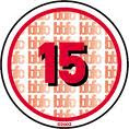
Our target audience is teenagers and young adults however our actual certification rating is age 15. We have chosen this age rating because it will allow us to have a wider target audience yet also let people know that it is a scary horror film as this enables them to see that it is unsuitable for young teenagers and children. The guidelines for a 15 rated film has been set out by the British Board of Films Classification and these are stated below:
Horror: Strong threat and menace are permitted unless sadistic or sexualised.
Imitable behaviour: Dangerous behaviour (for example, hanging, suicide and self-harming) should not dwell on detail which could be copied. Easily accessible weapons should not be glamorised.
Language: There may be frequent use of strong language (for example, ‘fuck’). Aggressive or repeated use of strong language is unlikely to be acceptable.
Nudity: Nudity may be allowed in a sexual context but without strong detail. There are no constraints on nudity in a non-sexual or educational context.
Sex: Sexual activity may be portrayed without strong detail. There may be strong verbal references to sexual behaviour, but the strongest references are unlikely to be acceptable unless justified.
Violence: Violence may be strong but should not dwell on the infliction of pain or injury. The strongest gory images are unlikely to be acceptable. Strong sadistic or sexualised violence is also unlikely to be acceptable. There may be detailed verbal references to sexual violence but any portrayal of sexual violence must be discreet and have a strong contextual justification.
Our genre is horror and we will ensure that it doesn't breach the guidelines of a 15 rated film. For example we will have some explicit horror scenes which will not be unsuitable for people under the age of 15 however we will not have any sex scenes or sadistic scenes. We will use some inappropriate language at certain points but our language throughout will be satisfactory for a 15 age certification film. Also we will include the use of sex appeal but not too much it will only be through the use of costume such as low cut top, ect. therefore it won’t be too detailed or strong. We will attract our target audience of 15 to adults by various factors in the trailer, such as showing elements of sex appeal, horror which attracts our audience because it is exciting for young adults and teenagers, typical convention of horror films such as a scary doll and mirror with scary writing on it which will be inviting to the audience as they are familiar with these elements in horror films, alcohol, ect.
 This is a list of some horror films rated 15:
These films are very effective in terms of being scary and they have managed to achieve this even with certain restrictions which is exactly what we aim to do.
The orphanage
Pitch Black
Disturbia
The exorcism of Emily Rose
Daybreakers
Paranormal Activity
Final Destination
1408
Our genre is horror and we will ensure that it doesn't breach the guidelines of a 15 rated film. For example we will have some explicit horror scenes which will not be unsuitable for people under the age of 15 however we will not have any sex scenes or sadistic scenes. We will use some inappropriate language at certain points but our language throughout will be satisfactory for a 15 age certification film. Also we will include the use of sex appeal but not too much it will only be through the use of costume such as low cut top, ect. therefore it won’t be too detailed or strong. We will attract our target audience of 15 to adults by various factors in the trailer, such as showing elements of sex appeal, horror which attracts our audience because it is exciting for young adults and teenagers, typical convention of horror films such as a scary doll and mirror with scary writing on it which will be inviting to the audience as they are familiar with these elements in horror films, alcohol, ect.
 This is a list of some horror films rated 15:
These films are very effective in terms of being scary and they have managed to achieve this even with certain restrictions which is exactly what we aim to do.
The orphanage
Pitch Black
Disturbia
The exorcism of Emily Rose
Daybreakers
Paranormal Activity
Final Destination
1408
Subscribe to:
Comments (Atom)


